The Challenge
Although Shopee is widely used in Brazil, the app still follows purchasing patterns common in Asian markets. This creates friction for local users — especially during the long and often confusing checkout process.
Hypothesis
Users feel overwhelmed during checkout, increasing the chances of cart abandonment before completing their purchase.
Understanding the problem
81%
said the app’s navigation is confusing
31.1%
believe the purchase flow needs improvement
“How can we make the cart and payment flow smoother and more intuitive, without skipping important steps?”
What we aimed to solve
Reduce cart abandonment
Streamline the experience and reduce friction.
Build user confidence and loyalty
Create a trustworthy checkout that encourages return.
Adapt the checkout flow to local expectations
Customize the flow for Brazilian users.
Key opportunities
Simplify
Break the process into smaller, guided steps
Organize
Clarify and organize critical information
Double Check
Allow full review before finalizing
Familiarity
Use a layout more familiar to Brazilian users
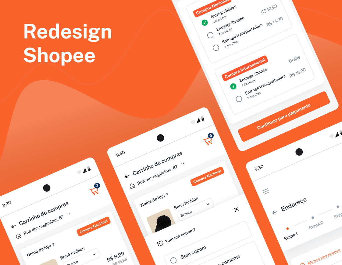
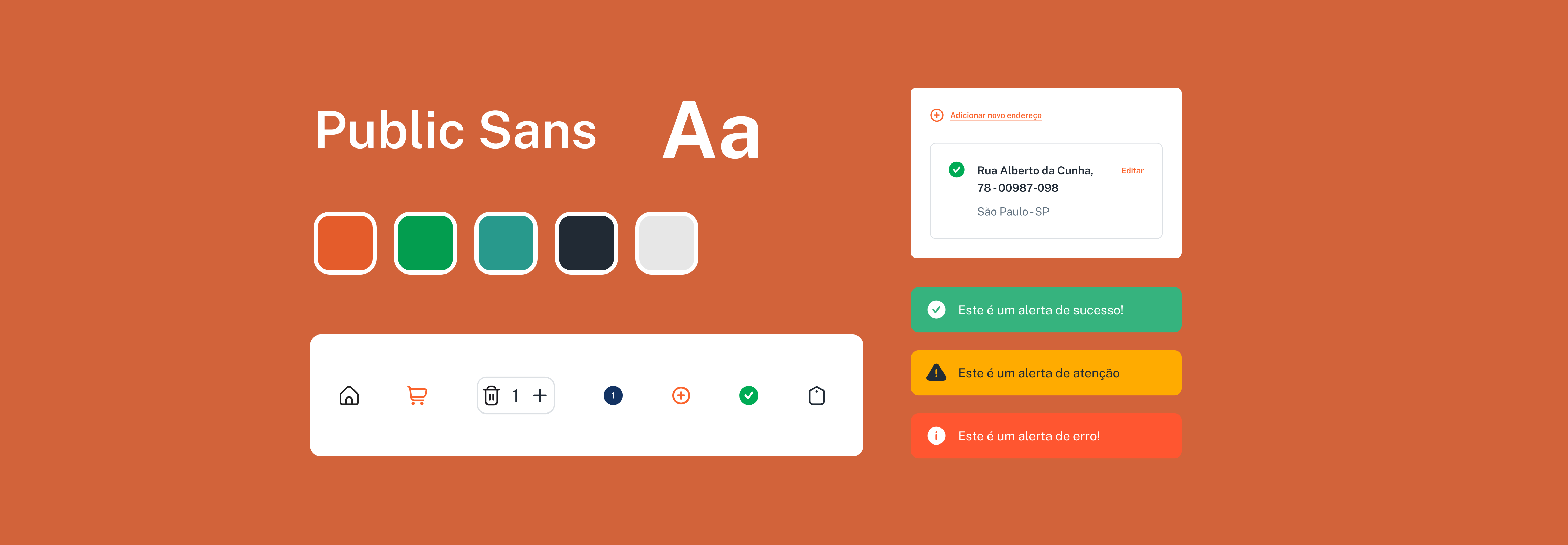
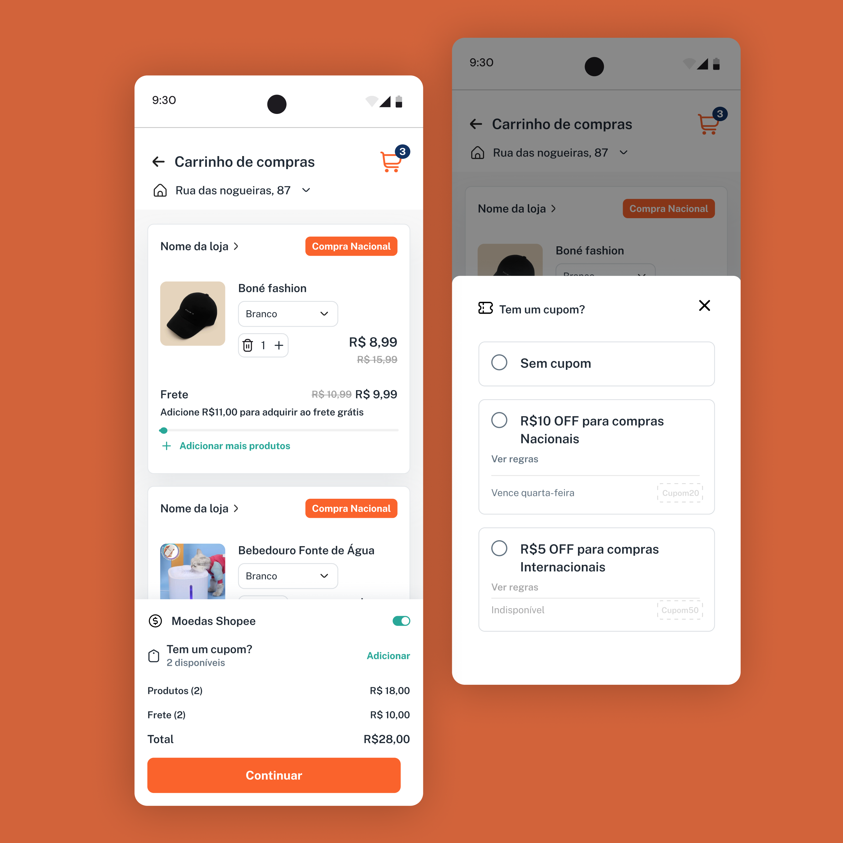
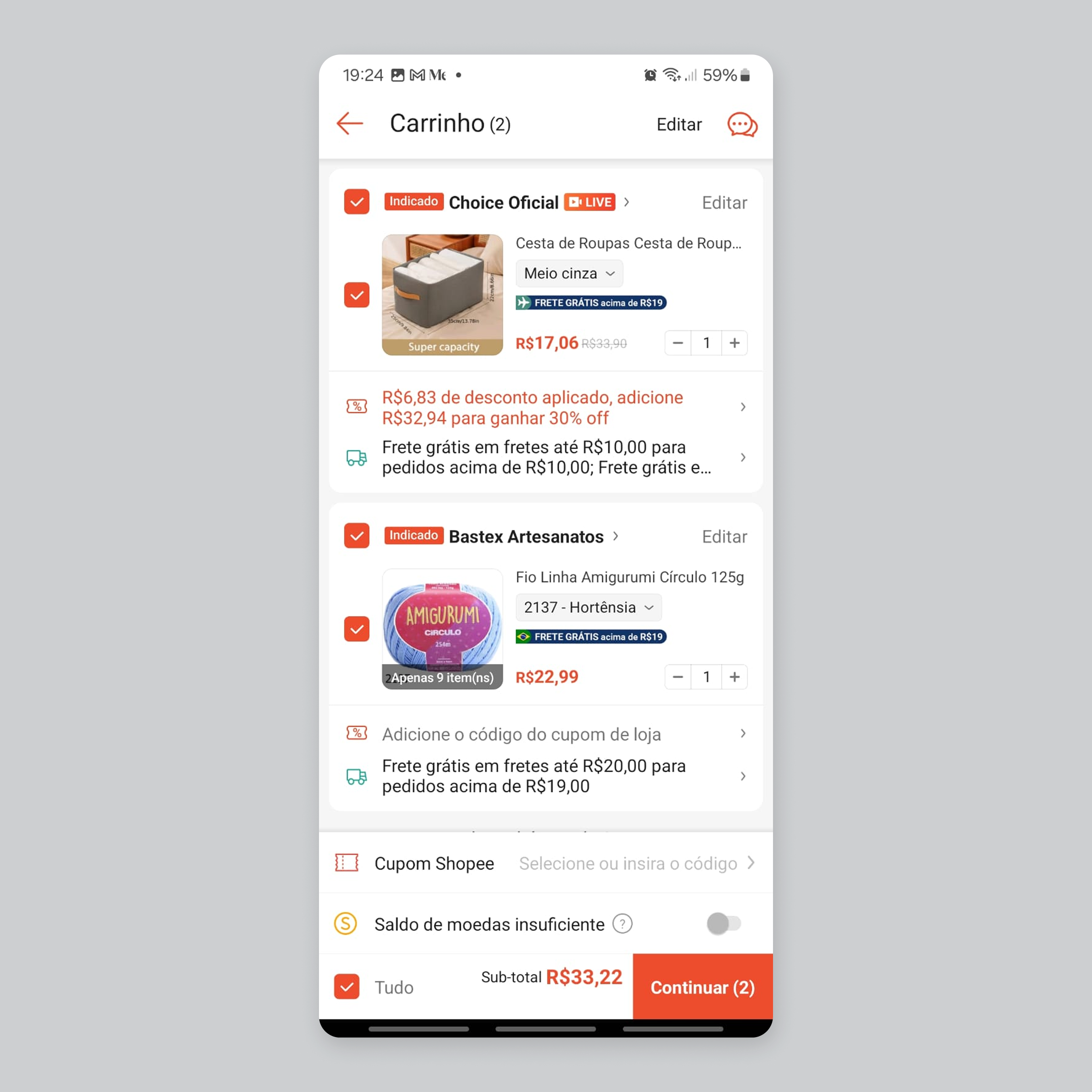
Shopping Cart
For the shopping cart, we focused on a clear font hierarchy with ample spacing, visible shipping calculations and progress indicators, clear distinction between national and international orders to avoid misinterpretations, and highlighted coupons alongside a detailed subtotal.
Before
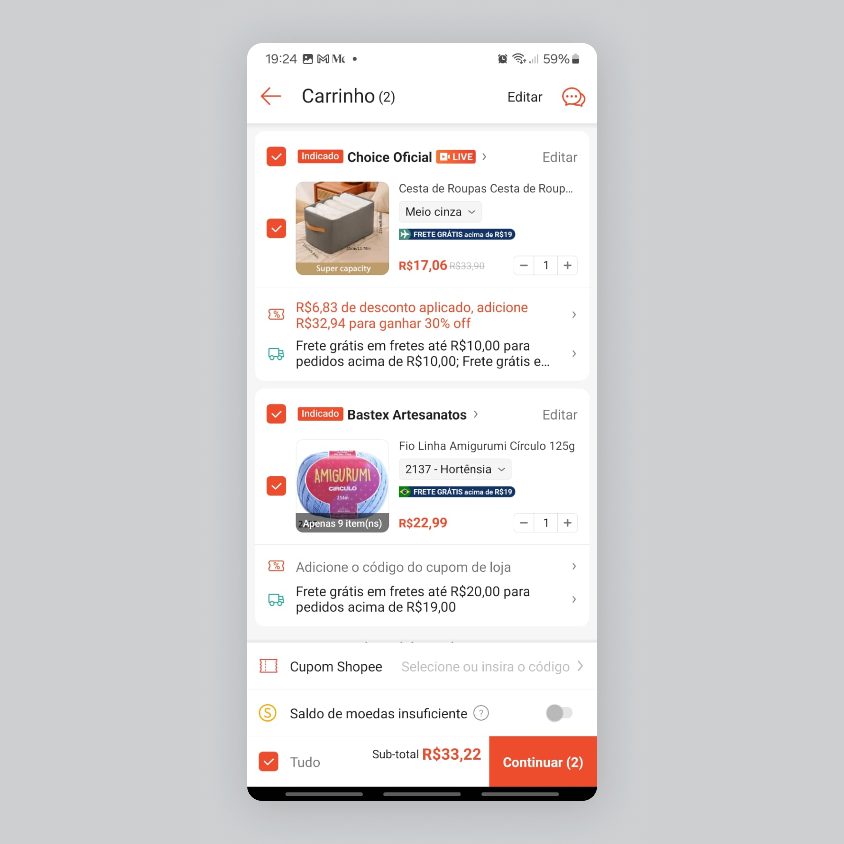
After
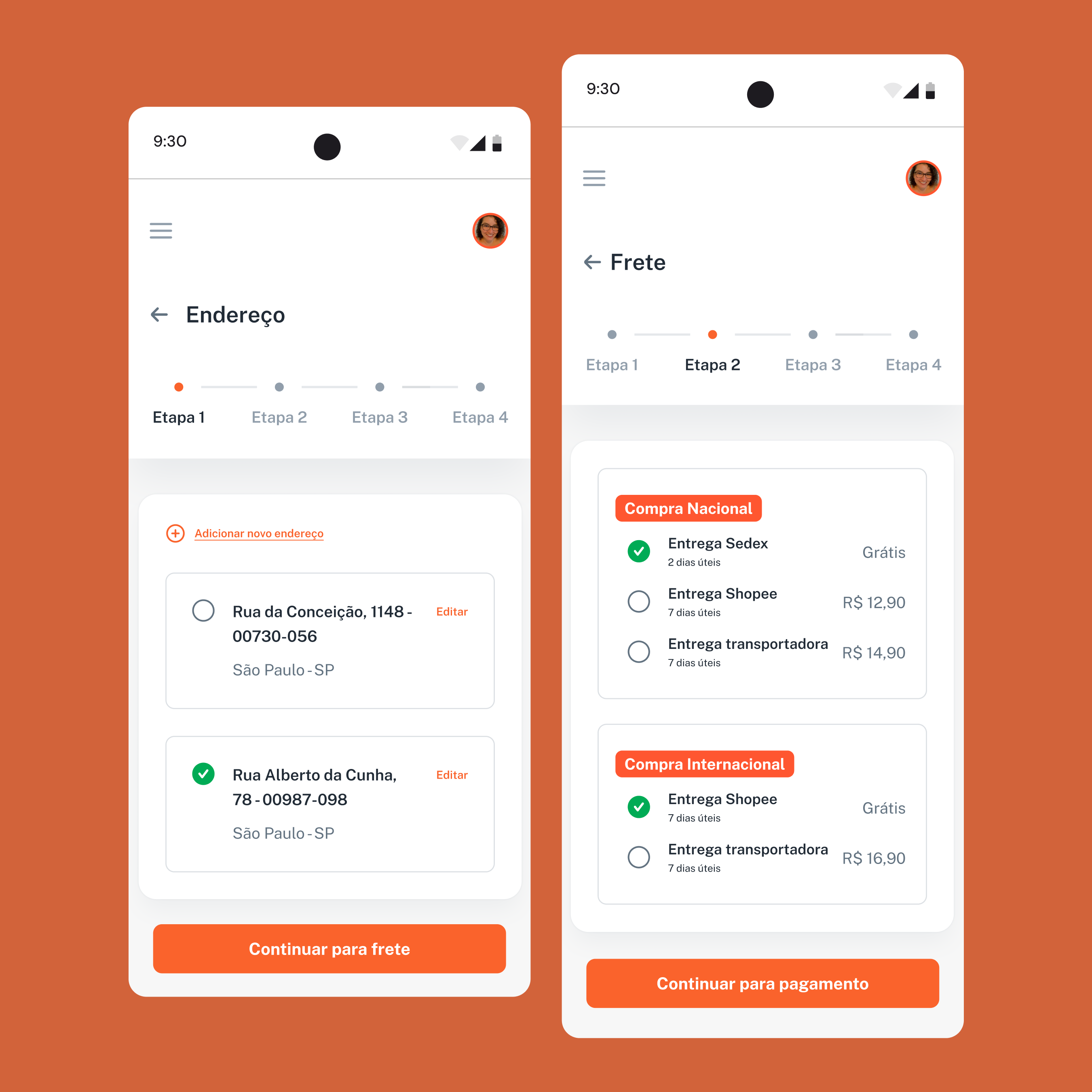
Shipping & Address
Our step-by-step navigation clearly shows users which step they are on, reducing cognitive load and simplifying the checkout process with easier address selection and editing, along with clear shipping options for a smoother experience.
Before
After
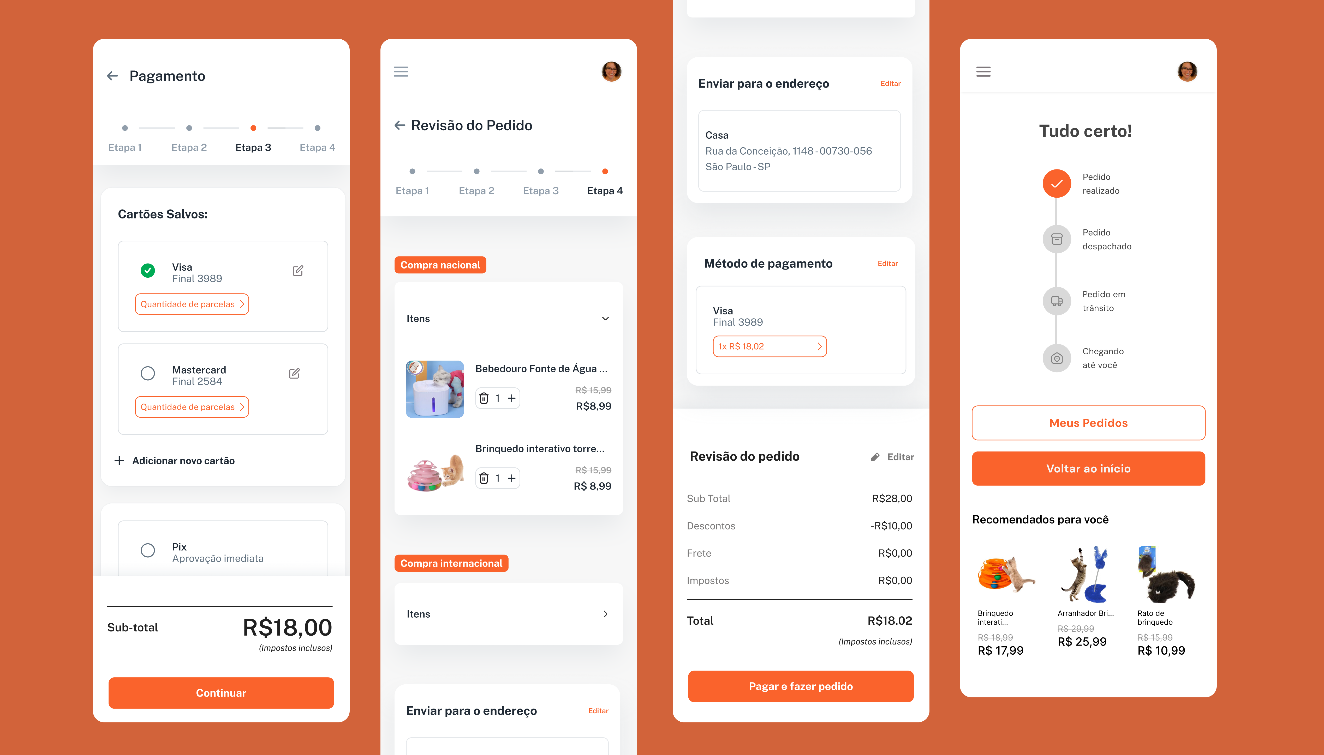
Payment & Confirmation
The frictionless payment method selection, combined with a clear order summary before checkout and the ability to edit any step, ensures a controled experience, while the post-purchase timeline keeps users informed.
High-fidelity prototype
Click to interact
Results and user feedback
“The design feels simple and easy to use. I didn’t face any issues completing my order. I like the cleaner look, fewer distractions and clearer information.”
Main takeaways
✅ Lower cognitive load = faster, smoother purchases
✅ Users could easily review all their details
✅ More intuitive and distraction-free experience
✅ Clearer delivery expectations
✅ Post-purchase timeline reduced support tickets
Conclusion
By adjusting the structure and visuals of Shopee’s checkout flow, we made the experience more fluid, user-friendly, and culturally aligned with Brazilian users. This redesign shows how adapting a global product to users needs can improve clarity, trust, and user satisfaction.
This was the final project for the Advanced UX/UI Design course at CoderHouse, a 50-hour program over 13 weeks. CoderHouse is an online school committed to providing high-quality, accessible education across Latin America.